Flutter Beautiful AppDrawer with Collaspe Menu
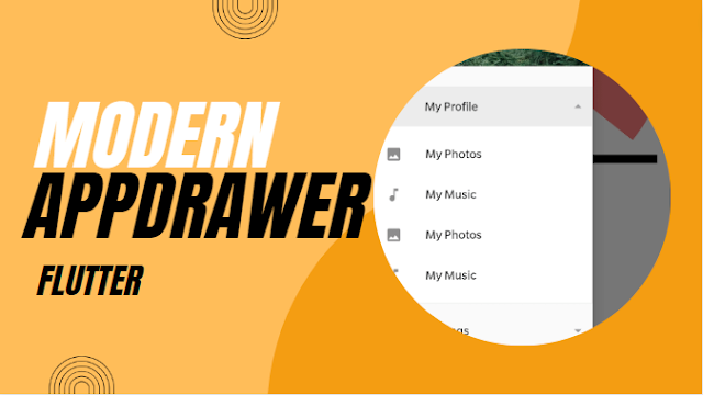
In this example, we are going to show you how to implement App Drawer with Expandable widget using Accordion in Flutter. App Drawer is a very important components of any kind of user interface for sectioned layout. See the example below:
How to create AppDrawer in Flutter
First, add those dependency to your flutter project. It will be needed for collapsible menu item.
flutter pub add accordion
Now, create a new file appdrawer.dart and import accordion package on it.
import 'package:flutter/material.dart';
import 'package:accordion/accordion.dart';
Now, we have to design our App Drawer. Create a stateful we did below:
class AppDrawer extends StatefulWidget {
  const AppDrawer({super.key});

  @override
  State<AppDrawer> createState() => _AppDrawerState();
}

class _AppDrawerState extends State<AppDrawer> {
  @override
  Widget build(BuildContext context) {
    GlobalKey<ScaffoldState> scaffoldKey = GlobalKey<ScaffoldState>();
    return Drawer(
      child: ListView(
        padding: EdgeInsets.zero,
        children: <Widget>[
           UserAccountsDrawerHeader(
                  accountName: Text('AR Rahman'),
                  accountEmail: Text('arrahman.bd@outlook.com'),
                  currentAccountPicture: CircleAvatar(
                    child: ClipOval(
                      child: Image.network(
                        'https://avatars.githubusercontent.com/u/74553735?v=4',
                        width: 90,
                        height: 90,
                        fit: BoxFit.cover,
                      ),
                    ),
                  ),
                  // ignore: prefer_const_constructors
                  decoration: BoxDecoration(
                      image: const DecorationImage(
                    image: NetworkImage('https://picsum.photos/800'),
                    fit: BoxFit.cover,
                  )),
                ),
          const ListTile(
            //menu item of Drawer
            leading: Icon(Icons.home),
            title: Text('Home Page'),
          ),
          Accordion(
          maxOpenSections: 1,
          headerBackgroundColorOpened: Colors.black54,
          scaleWhenAnimating: true,
          openAndCloseAnimation: true,
          paddingListHorizontal: 0,
          headerBorderRadius: 0,
          contentBorderRadius: 0,
          headerPadding:
          const EdgeInsets.symmetric(vertical: 0, horizontal: 0),
          children: [
            AccordionSection(
              isOpen: true,
              rightIcon: const Padding(
                padding:  EdgeInsets.symmetric(horizontal: 8),
                child: Icon(Icons.arrow_drop_down, color: Colors.grey),
              ),
              headerBackgroundColor: Colors.transparent,
              headerBackgroundColorOpened: const Color.fromARGB(255, 236, 236, 236),
              contentBorderColor: const Color.fromARGB(255, 236, 236, 236),
              contentBorderRadius: 0,
              header: const ListTile(
            leading: Icon(Icons.account_circle),
            title: Text('My Profile'),
          ),
              content:  Column(
                children: [
                  const ListTile(
            leading: Icon(Icons.photo),
            title: Text('My Photos'),
          ),
          const ListTile(
            leading: Icon(Icons.music_note),
            title: Text('My Music'),
          ),
                ],
              ),
              contentHorizontalPadding: 0,
              contentBorderWidth: 1,
            ),
           AccordionSection(
              isOpen: true,
              rightIcon: const Padding(
                padding:  EdgeInsets.symmetric(horizontal: 8),
                child: Icon(Icons.arrow_drop_down, color: Colors.grey),
              ),
              headerBackgroundColor: Colors.transparent,
              headerBackgroundColorOpened: const Color.fromARGB(255, 236, 236, 236),
              contentBorderColor: const Color.fromARGB(255, 236, 236, 236),
              contentBorderRadius: 0,

              header: const ListTile(
            leading: Icon(Icons.settings),
            title: Text('Settings'),
          ),
              content:  Column(
                children: [
                  const ListTile(
            leading: Icon(Icons.account_circle),
            title: Text('Account Settings'),
          ),
          const ListTile(
            leading: Icon(Icons.edgesensor_high),
            title: Text('Sensor Settings'),
          ),
                ],
              ),
              contentHorizontalPadding: 0,
              contentBorderWidth: 1,
            ),

          ],
        ),
         ListTile(
              onTap: () {
                if (scaffoldKey.currentState!.isDrawerOpen) {
                  Navigator.pop(context);
                }
              },
              leading: const Icon(Icons.close),
              title: const Text("Close Drawer"))
        ],
      ),
    );
  }
}
Add Drawer to Scaffold
Now let's call our drawer on HomePage Scaffold. Simply add this line inside scaffold.
drawer: AppDrawer()
Explanation
Here AccordionSection() contains some widget that will open when someone click on Accordion Section.UserAccountsDrawerHeader() is the widget for profile cards on top.
Conclusion
How this App Drawer Template will help you to gain perfect App Drawer without any coding. If you think it's helpful, then leave a comment below.
